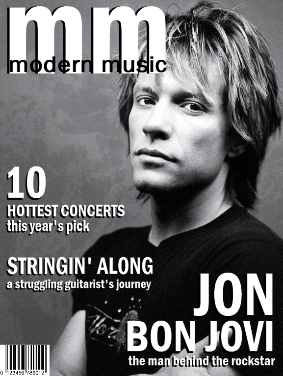
I finally finished (I think) the magazine cover design I had to do for my Visual Communication midterm. I blended designs and headlines from the
original covers I did several weeks ago, plus tweaked and added new stuff.
What do you all think? Feedback is really appreciated!

3 comments:
I like this layout the best, but the title is a little off. The shadows on the "mm" and the letters in "modern music" (where they touch) makes it look a bit off. I love tye B&W look, though. What about making the mag title the single splash of color?
This is way cooler than anything I could ever hope to come up with :) You're very creative! I may just give you a jingle the next time I get around to re-designing my site :)
Cheers!
~ Hath
Becky I absolutely love it, but do completely agree with both of Hath's suggestions. I love the idea of a splash of color.
Great job though, wish I were that creative!
Misty
Thanks ladies! I agree with the color thing - and I will see what I can come up with this afternoon. :) I appreciate it!
Post a Comment