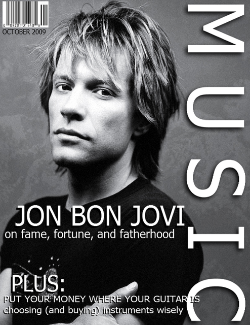
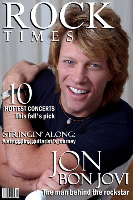
So in my Visual Communication class, our main semester project is to design a magzine cover. Any topic. Any theme. Any style. We play the part of the magazine's editor, and the sky is the limit as to what we create...as long as we incorporate what we've learned including design, typography, etc. We haven't gone over everything yet, of course, it's only the start of the semester! But our professor advised that we at least start fiddling with ideas and styles so we aren't scrambling the night before the project is due.
Well, this is RIGHT up my alley. I love graphic design - it's one of my favorite hobbies/pastimes, and while I certainly don't claim to be a genius with Photoshop, I had fun doing mockups of my idea for the project.
And of COURSE it involves Jovi. You're surprised? ;)
So what do you think of these two designs? Remember, they're pretty rough, and I still have a lot of finalizing, tweaking, editing, etc. to do before the final project. But I need to know if the basic idea is good enough to consider or not:
P.S. I'm working on Richie ones, too. :)


7 comments:
Yo. I'm really liking the first one. Something about the black and white, the pic, the font even...I can almost feel the 'edge'.
I do like the topics you chose for Rock Times though. Especially the "stringing along" and "hottest concerts" bits.
Maybe somehow combining the two?
Both are great though - you know I'm a huge fan of your graphics work. Can't wait to see more!
Thanks Dee! You know your feedback is always appreciated. :)
These are great Becky. I love, love the B&W pic, like the font of the second one, and love the Jon Bon Jovi, the man behind the rockstar topic too. Great job, can't wait to see the finished product and the Richie covers too!
I like the 2nd one!!!It's something about his smile...Very nice Becks!!
I LOVE the b&w one LOVE it! But I have to agree with the others on the topics for # 2....
Can I put my request in now for a David one? :p (Im Kidding)
Love, love, love the B&W one but really want to read JBJ The man behind the rockstar from the other one. That article would definately make me buy a magazine. :)
Thank you all so much for the suggestions! They really help a lot, because I was honestly leaning more toward the second one personally. But now that I read what you all have to say, I am definitely liking a combination of #2's headlines with #1 design. I like the fonts in #2 better though - they're sharper. Yeah?
Post a Comment